 Accessible Shopfront
Readable text and clear links
By the end of this step: you will be able to check that your text still works when zoomed, write links that make sense on their own, and keep your wording plain.
The short version
- People must be able to zoom your text to 200% and still use the page.[1]
- On a narrow screen, text should wrap. Nobody should have to scroll sideways to read.
- Link words should say where the link goes. Avoid "click here".
- Plain words and short sentences help every customer.
Step 1: Let people zoom
Some people zoom in a little, maybe because they forgot their glasses. Others zoom in a lot, to 200% or more.[2]
WCAG 1.4.4 Resize Text (Level AA) covers this. Text must grow to 200% without anything breaking or going missing.[1]
To zoom in most browsers, hold Ctrl (or Cmd on a Mac) and press +.[2]
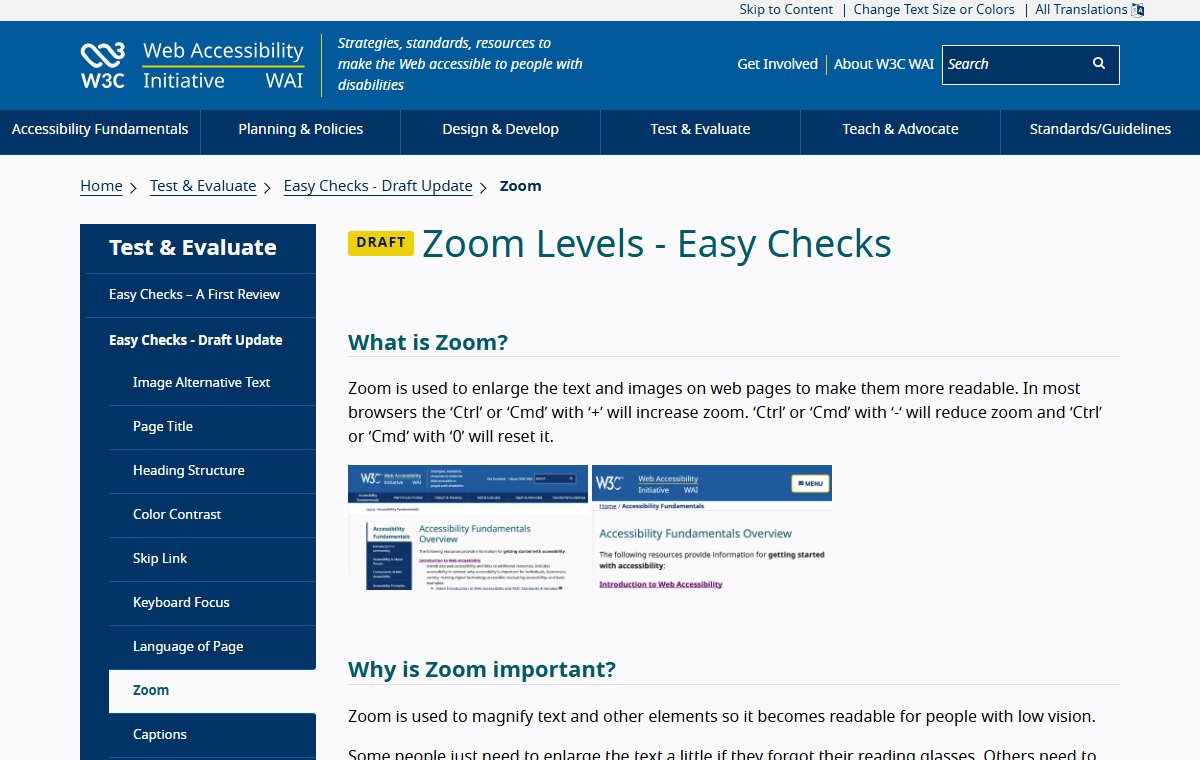
When you zoom, check that:
- All the text is still there and readable.
- No text is hidden behind other text or pictures.[2]
- Every menu, button and form still works.
It is fine if your menu turns into a menu button when you zoom.[2]
Step 2: Make text wrap, not run off
WCAG 1.4.10 Reflow (Level AA) goes further. It asks that a page works at a width of 320 CSS pixels without sideways scrolling.[1] That is about the same as a wide laptop screen at 400% zoom.[1]
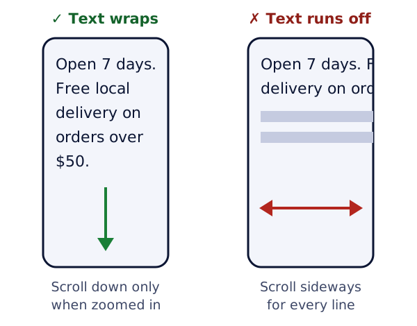
In plain terms: when the screen gets narrow, the text should wrap onto new lines. Readers should only scroll down, not across.
Watch out for wide tables and for boxes set to a fixed width. They often stop text from wrapping.
Step 3: Use real text, not pictures of text
Words inside a picture go blurry when zoomed. A screen reader can't read them either, unless you add alt text. WCAG 1.4.5 Images of Text (Level AA) asks you to use real text where you can.[1]
Example: a sale banner made in a design app is one big image. Instead, put the words "Winter sale ends Sunday" as real text over a plain background.
Step 4: Write clear link text
Link text is the words you click on. It should tell people where the link goes.
WCAG 2.4.4 Link Purpose (In Context) is Level A. People should be able to tell what each link does from its words, or from the sentence around it.[1]
Screen readers can list all the links on a page by themselves.[3] In that list, "click here" means nothing.
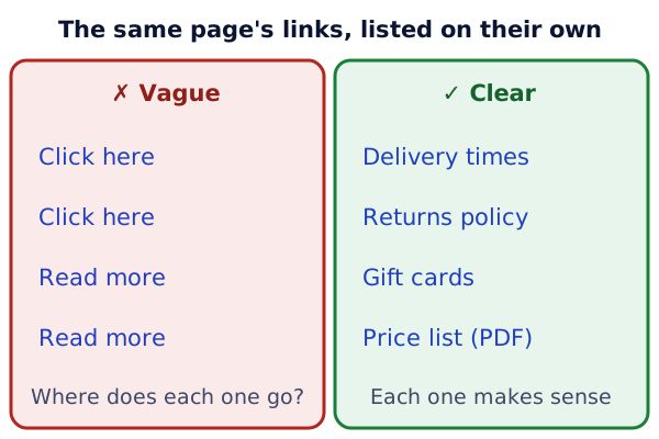
W3C says to avoid vague words like "click here" and "read more".[4] MDN calls linking only "click here" a common mistake.[3]
- Instead of "To see our prices, click here", write "See our price list". Make "price list" the link.
- Instead of a bare "Read more", write "Read more about delivery times".
- If a link opens a file, say so, like "Price list (PDF, 2 MB)".[4]
Step 5: Keep your words plain
Clear writing is part of accessibility. W3C's tips are simple:[4]
- Write short, clear sentences and paragraphs.
- Skip hard words when an easy one will do.
- Spell out short forms the first time, like "Goods and Services Tax (GST)".
WCAG 3.1.5 Reading Level asks for extra help when text is harder than lower secondary school level.[1] That one is Level AAA, so it goes past our AA goal. But plain writing costs nothing and helps everyone.
Try it on your site
- Open your home page on a computer. Zoom in until the text is twice its normal size. Note anything that breaks.
- Make the browser window as narrow as it goes. Do you need to scroll sideways?
- Search your site for "click here" and "read more". Rewrite each link to say where it goes.
- Pick one long paragraph. Split it into shorter sentences.
Sources
- Web Content Accessibility Guidelines (WCAG) 2.2, W3C (accessed 2026-10-18)
- Zoom Levels - Easy Checks, W3C Web Accessibility Initiative (accessed 2026-10-18)
- <a>: The Anchor element, MDN Web Docs (accessed 2026-10-18)
- Writing for Web Accessibility, W3C Web Accessibility Initiative (accessed 2026-10-18)