 Accessible Shopfront
Colour and contrast
By the end of this step: you will be able to check your text and button colours, and make sure colour is never the only clue.
The short version
- Contrast is how much text stands out from its background.
- WCAG Level AA asks for a ratio of at least 4.5:1 for normal text and 3:1 for large text.
- An online checker can tell you the ratio for any two colours.
- Never use colour as the only way to show something, like an error.
Why contrast matters
Pale grey text on a white page looks stylish. But many people struggle to read it.
Good contrast helps people with low vision.[1] It also helps people with colour blindness.[1] And it helps anyone reading a phone in the sun. W3C's goal for this rule is simple: text can be seen by more people.[2]
Step 1: Learn the contrast ratio
A contrast ratio compares how light two colours are. It runs from 1:1 to 21:1.[3]
- 1:1 means no difference at all, like white text on white.
- 21:1 is the most possible, like black text on white.
WCAG success criterion 1.4.3 Contrast (Minimum) is Level AA. It asks for:
Large text means at least 18 point, or 14 point if it is bold.[3] On a website, that is about 24px, or about 18.5px bold.[2]
Here are five real examples on a white background. We worked out each ratio with the WCAG formula.
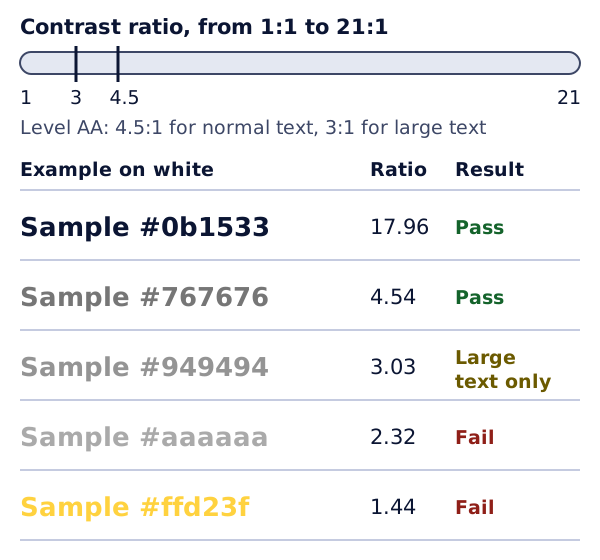
Notice how close #767676 and #777777 look. The first one just passes at 4.54:1. The second just fails, at 4.48:1. You can't judge this by eye. Always measure it.
Step 2: Check your colours
Every colour on a website has a code. One common kind is a hex code, like #eed009 for a gold colour.[1] Your website editor or brand guide will list yours.
A contrast checker takes two hex codes and gives you the ratio. WebAIM's checker is one example. It shows a pass or fail for normal and large text.[4]
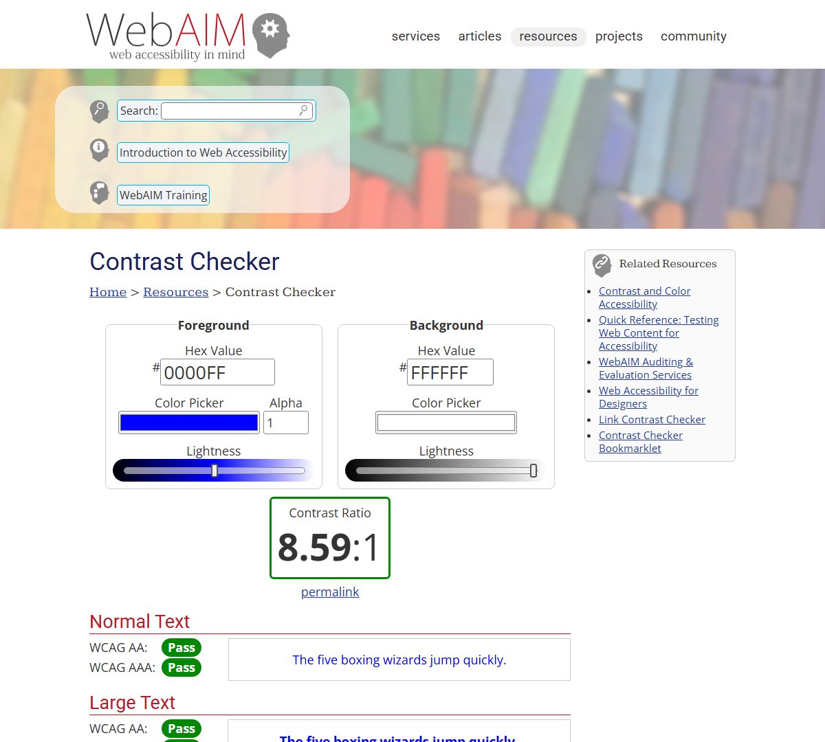
Check these pairs on your site:
- Your main text and its background.
- Your link colour and its background.
- Button text and the button colour.
- Any text placed over a photo or a coloured band.[5]
Logos don't have to meet the contrast rule.[5] Neither does text that just happens to be in a photo, like a street sign.[5]
Quick check: view your page in greyscale. Anything hard to read is a warning sign.[1]
Step 3: Check buttons, fields and icons
Contrast isn't only for words. WCAG 1.4.11 Non-text Contrast (Level AA) covers the parts people need to see to use a control. Examples are the edge of a text box or a simple icon. They need at least 3:1 against the colours next to them.[3]
Example: a search box with a very pale grey border can be hard to find. A darker border fixes it.
Step 4: Never rely on colour alone
WCAG 1.4.1 Use of Color (Level A) says colour must not be the only way to show information.[3] Some people can't tell certain colours apart.
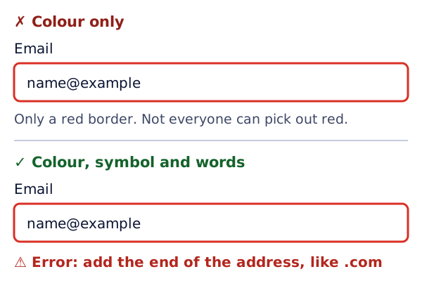
Add a second clue, like a symbol, a word or a pattern. For example, mark required fields with an asterisk as well as a colour.[5] On a chart, add labels as well as colours.[5]
If your brand colours fail
You don't need a new brand. Try these:
- Use a darker shade of your brand colour for text and links.
- Keep the bright shade for large shapes, borders and backgrounds.
- Try white text on your colour, then dark text. Keep the one with the higher ratio.
Then run the new colours through the checker again.
Try it on your site
- Find the hex codes for your text, link and button colours.
- Put each pair into a contrast checker. Write down each ratio.
- Mark any normal text below 4.5:1, and any large text below 3:1.
- Look at your forms. Is anything shown by colour alone? Add a word or symbol.
Sources
- Color Contrast - Easy Checks, W3C Web Accessibility Initiative (accessed 2026-10-18)
- Understanding Success Criterion 1.4.3: Contrast (Minimum), W3C Web Accessibility Initiative (accessed 2026-10-18)
- Web Content Accessibility Guidelines (WCAG) 2.2, W3C (accessed 2026-10-18)
- Contrast Checker, WebAIM (accessed 2026-10-18)
- Designing for Web Accessibility, W3C Web Accessibility Initiative (accessed 2026-10-18)