 Accessible Shopfront
Forms and buttons
By the end of this step: you will be able to give every form field a clear label, write error messages that help, and choose between a button and a link.
The short version
- Every form field needs a visible label that says what to enter.
- Say which fields are required, in words.
- When something goes wrong, say what and how to fix it.
- Use a link to go somewhere and a button to do something.
Why forms matter so much
Forms are where customers act. They book, buy, ask and sign up. If a form doesn't work for someone, they can't become your customer.
This step covers contact forms, booking forms and checkouts. The same rules apply to all of them.
Step 1: Label every field
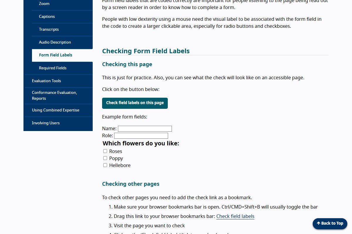
A label is the text next to a form field. It tells people what to type or which box to tick.[1] Every field needs one, including checkboxes and drop-down menus.[2]
This is WCAG 3.3.2 Labels or Instructions (Level A).[3]
The label must also be joined to its field in the code. Then a screen reader reads the label when someone reaches the field.[1] Clicking the label also selects the field, which gives people a bigger area to click.[1]
Don't use grey hint text inside the box as the only label. It disappears as soon as someone starts typing.[4] W3C says hint text is not a replacement for a label.[4]
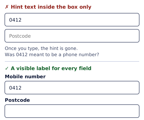
Put labels above the fields where you can. This helps people who zoom in and people on phones.[2]
Step 2: Mark required fields in words
Many forms mark required fields with a red asterisk (*). But screen readers often don't read the asterisk out.[5] It is also easy to miss.
The best way is to put the word "required" in the label.[5] For example: "Email (required)".
Step 3: Write helpful error messages
WCAG 3.3.1 Error Identification is Level A. If your form finds a mistake, it must point to the field and describe the problem in words.[3]
WCAG 3.3.3 Error Suggestion is Level AA. If you know how to fix the mistake, tell the person.[3]
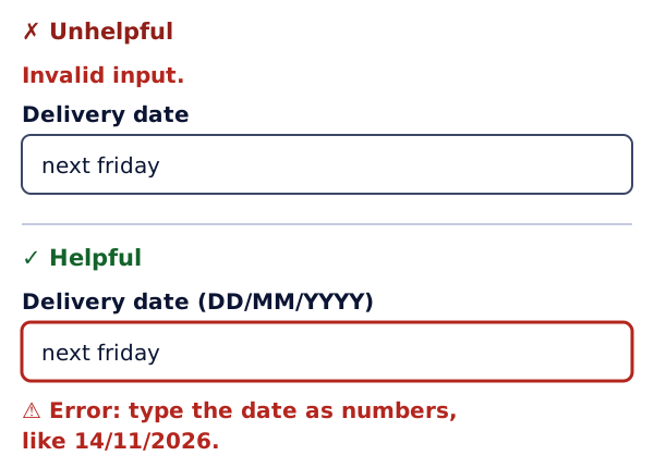
Good error messages are easy to understand. They also say how to fix the problem.[6]
- Bad: "Invalid input."
- Better: "Enter your email address, like [email protected]."
If there are several errors, list them at the top of the form too.[6] And don't show errors with colour alone, as you learned in Step 5.
Step 4: Help people fill in less
WCAG 1.3.5 Identify Input Purpose (Level AA) is about fields that ask for personal details, like a name or email. The page code should say what each one is for.[3] This is done with the autocomplete setting.
It lets the browser offer to fill in details it already knows.[7] That saves typing for people who find typing slow or hard.
Step 5: Use the right control
Links and buttons look alike but do different jobs.
- A link takes you somewhere, like another page or a file.[8]
- A button does something, like sending a form or opening a menu.[9]
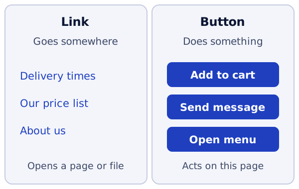
MDN says to use a link only to go to a real web address.[8] For anything else, use a button. WCAG 4.1.2 Name, Role, Value (Level A) says the code must say what each control is.[3] Then a screen reader can tell people whether it is a link or a button.
Make buttons big enough to press. WCAG 2.5.8 Target Size (Minimum) is new in WCAG 2.2 and is Level AA. It asks for targets of at least 24 by 24 CSS pixels, or enough space around smaller ones.[3][10]
Step 6: Don't make logging in a memory test
If customers log in, WCAG 3.3.8 Accessible Authentication (Minimum) applies. It is Level AA and new in 2.2. Logging in should not depend on remembering a password or solving a puzzle, unless there is help or another way.[3]
W3C gives two simple helps. Let password managers fill in the login form. And let people paste their password in.[11]
Try it on your site
- Open your contact form. Click on each label. Does the cursor jump into its field?
- Check every field has a visible label, not just grey hint text.
- Send the form empty on purpose. Read each error message. Does it say how to fix the problem?
- Fill in the whole form using only the keyboard, as you practised in Step 7.
Sources
- Form Field Labels - Easy Checks, W3C Web Accessibility Initiative (accessed 2026-10-18)
- Labeling Controls (Forms Tutorial), W3C Web Accessibility Initiative (accessed 2026-10-18)
- Web Content Accessibility Guidelines (WCAG) 2.2, W3C (accessed 2026-10-18)
- Form Instructions (Forms Tutorial), W3C Web Accessibility Initiative (accessed 2026-10-18)
- Required Fields - Easy Checks, W3C Web Accessibility Initiative (accessed 2026-10-18)
- User Notifications (Forms Tutorial), W3C Web Accessibility Initiative (accessed 2026-10-18)
- autocomplete HTML attribute, MDN Web Docs (accessed 2026-10-18)
- <a>: The Anchor element, MDN Web Docs (accessed 2026-10-18)
- Understanding Success Criterion 2.5.8: Target Size (Minimum), W3C Web Accessibility Initiative (accessed 2026-10-18)
- Understanding Success Criterion 3.3.8: Accessible Authentication (Minimum), W3C Web Accessibility Initiative (accessed 2026-10-18)